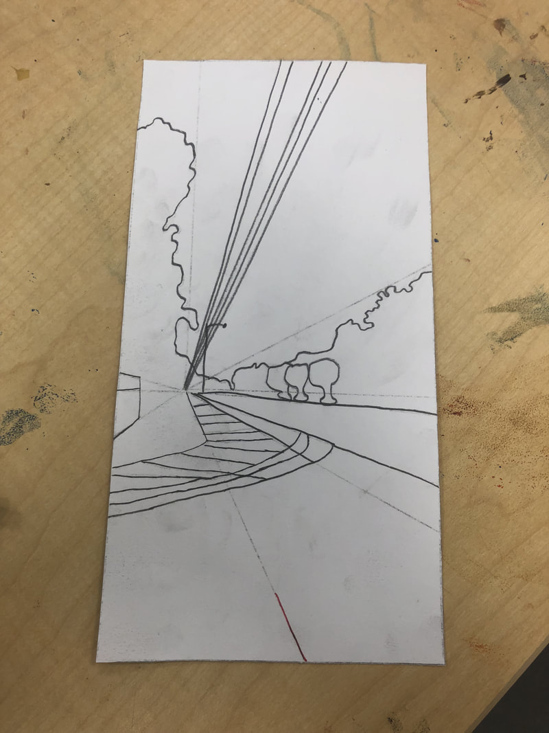
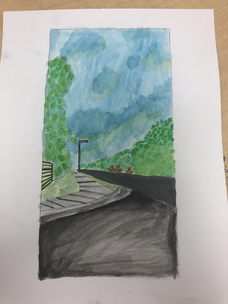
 This is a photo of the most helpful perspective warm up. 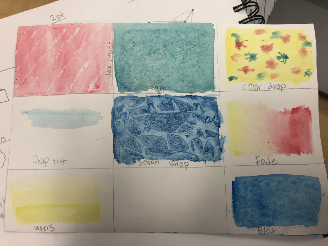 This is a photo of the most helpful watercolor warm up.
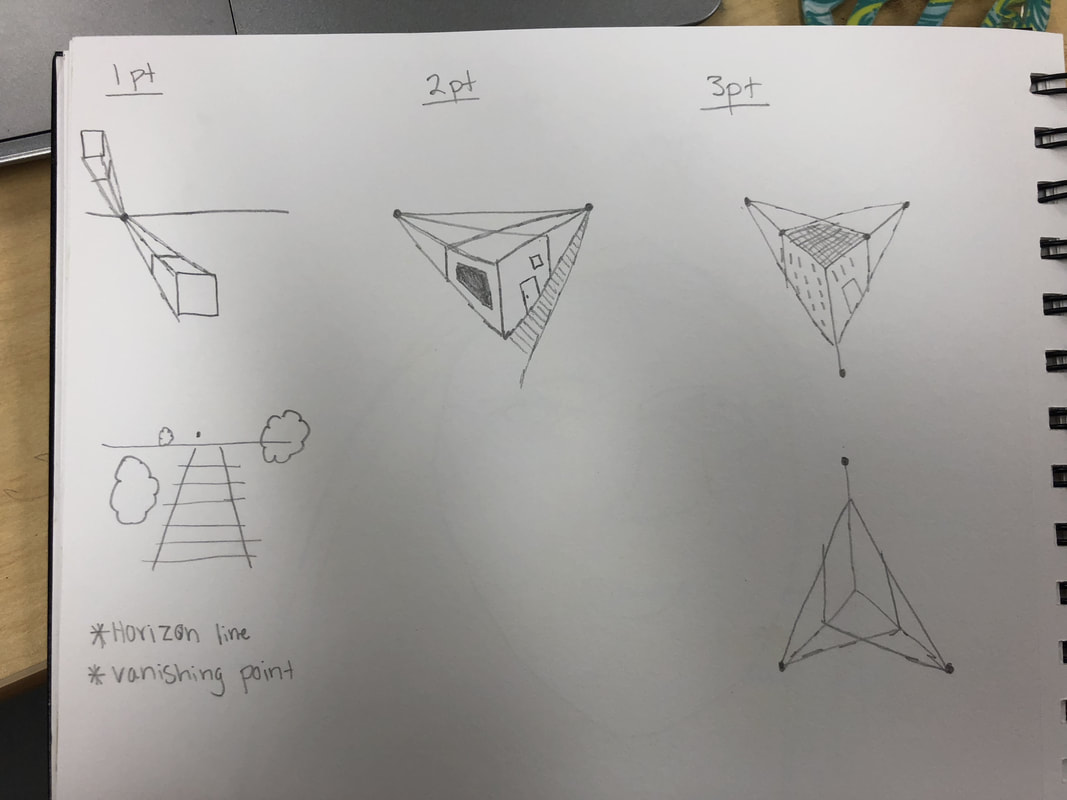
1. I used one point perspective.
2. I took this photo on my way to school one morning. It is the Apex Peakway coming out of Haddon Hall. 3. I found making the sidewalk the hardest part because making the perspective right was hard to do correctly. 4. The two warm ups I picked helped because I learned how to draw lines correctly with the first one and I learned how to fade the watercolor with the second one.
0 Comments
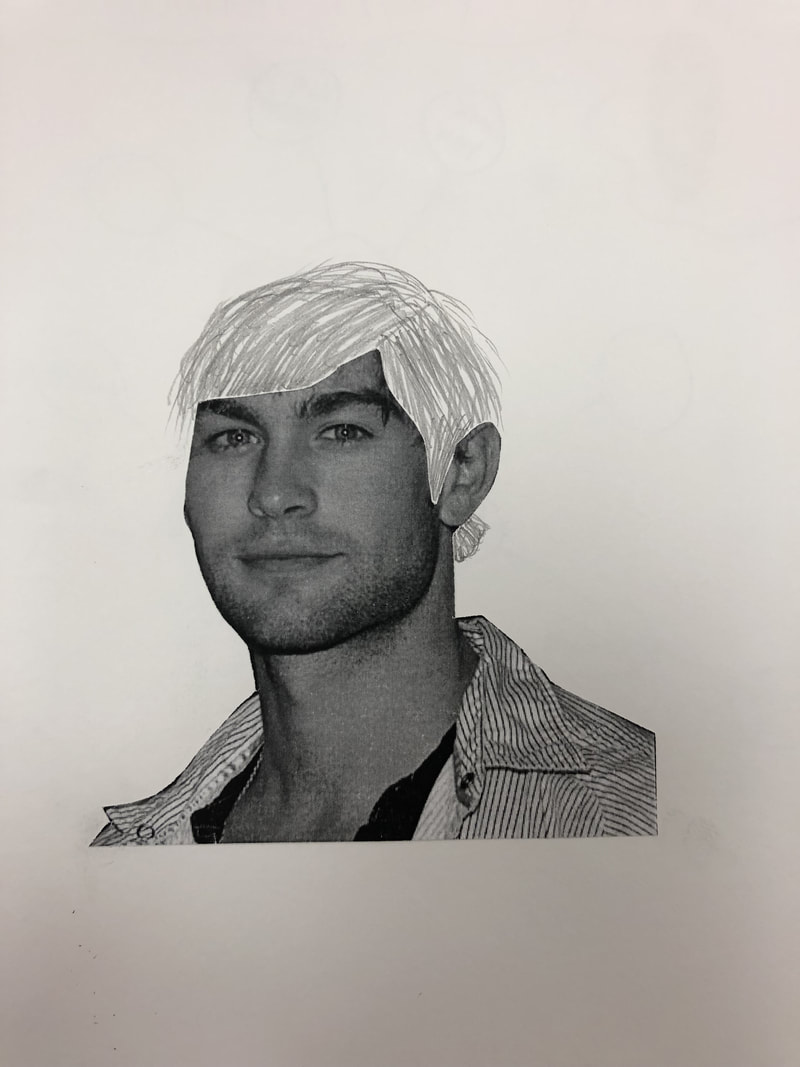
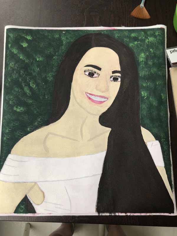 1. My portrait is of Ameera Haddad. She is one of my best friends.
2. Medium I used- paint. 3. I started with sketching out her figure first and then slowly adding in the paint in the right layers. 4. I find the hair and the dress successful, but I would change the face and the skin tone if I had to do this project again.
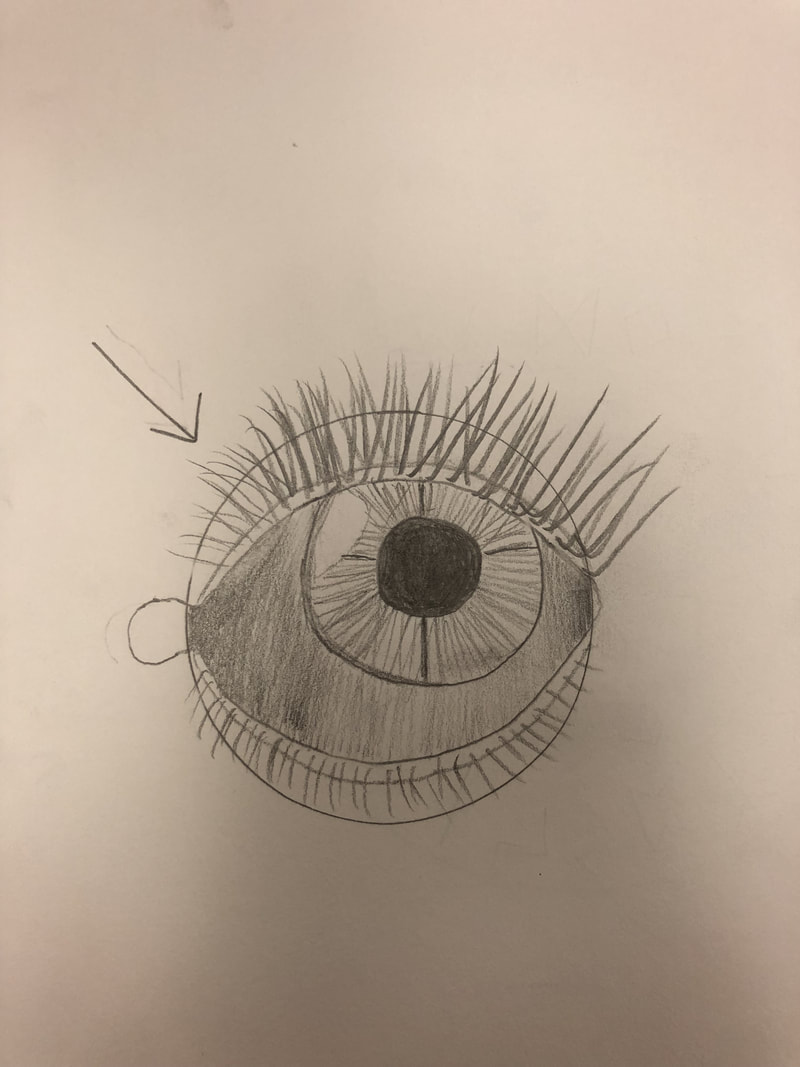
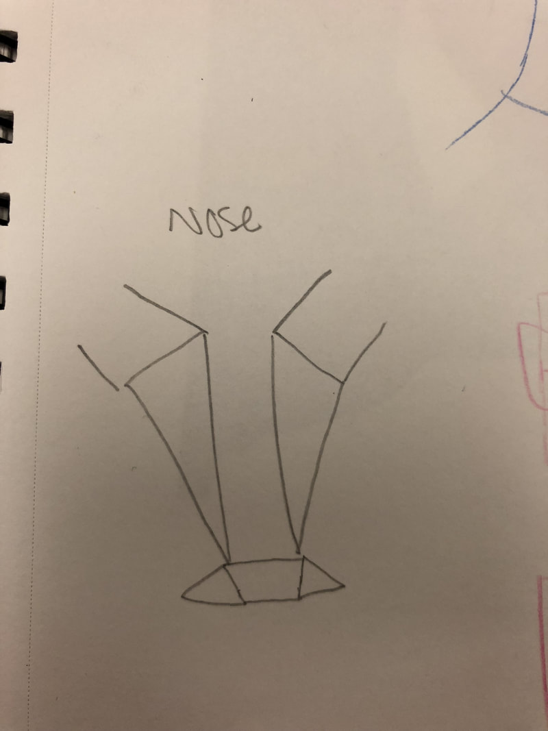
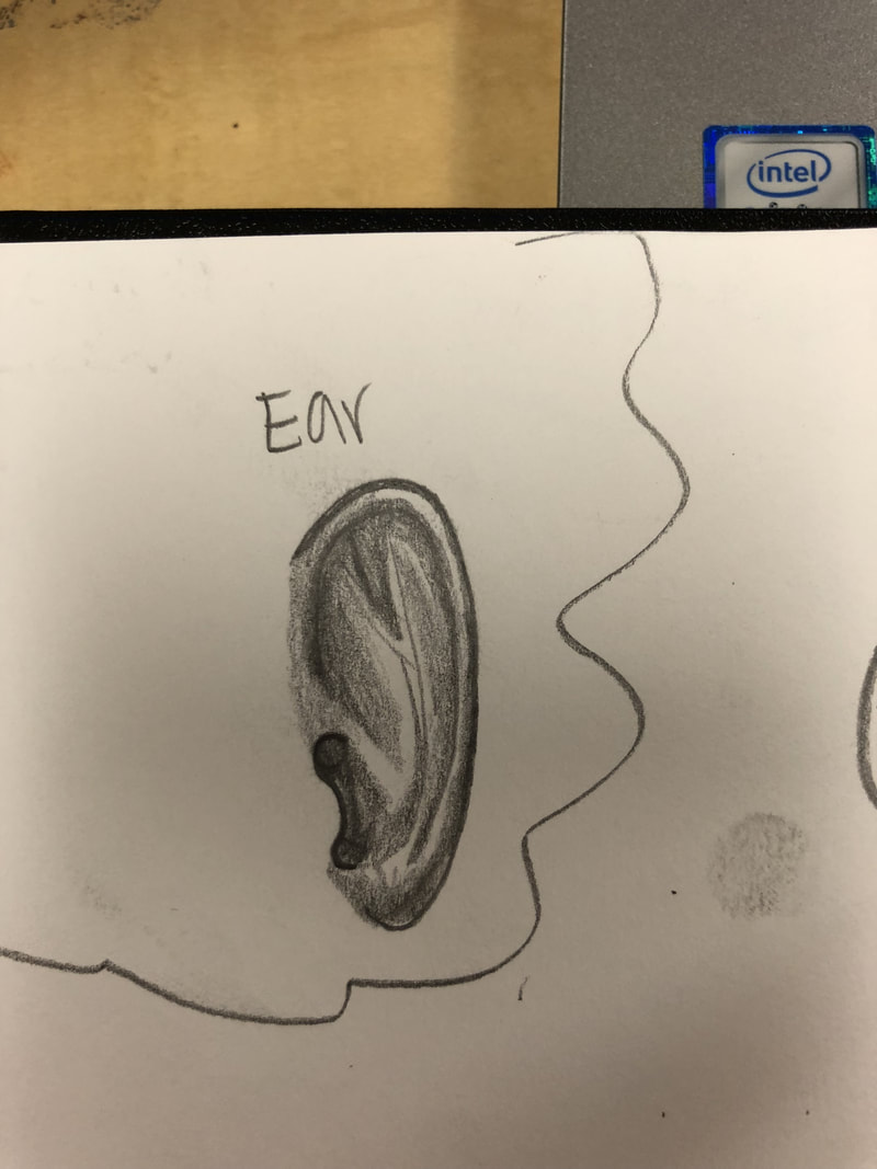
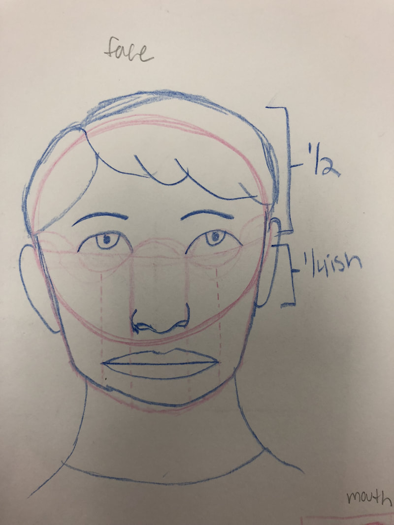
1. The most helpful warm up for this project was the eye practice. This was helpful because I learned how to shape the eye, add eyelashes, and shade it correctly according to where the light is coming from. 2. I found where the eyes are located was pretty surprising. I thought the eyes would be higher up, but they're actually pretty low down on the face.
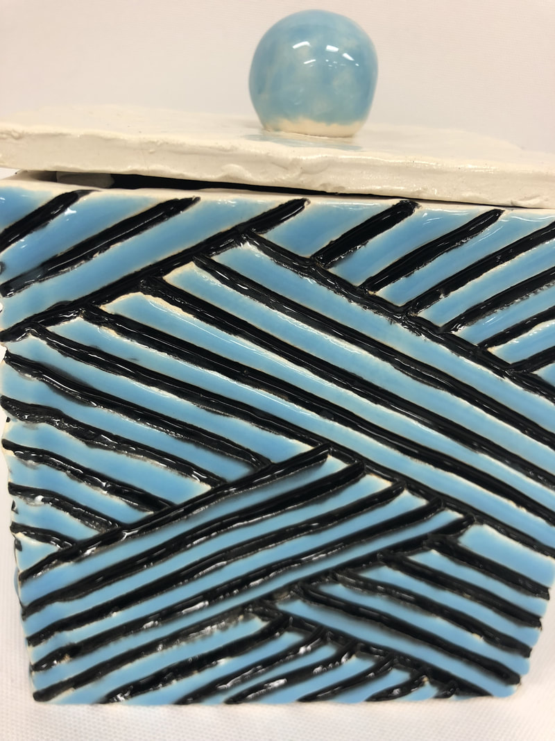
1. After my piece came out of the kiln after being fired I made sure to check over my glaze to see if all of the sides were covered. After that my piece was finished.
2. I find the shininess and shape successful because it all worked out the way I wanted it to. 3. If I were to do it again I would make sure to only paint inside the cracks very carefully instead of just doing it how I did because underneath the blue glaze you can somewhat see the black glaze.
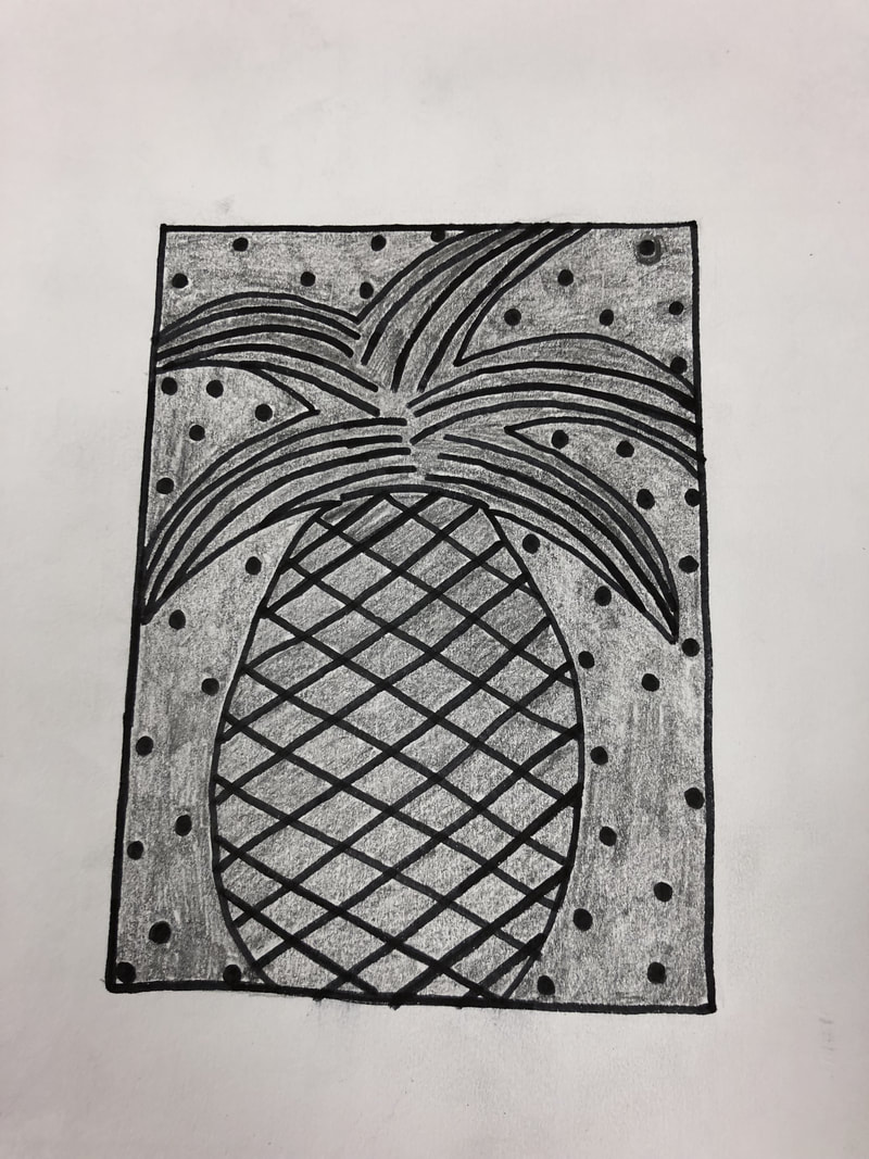
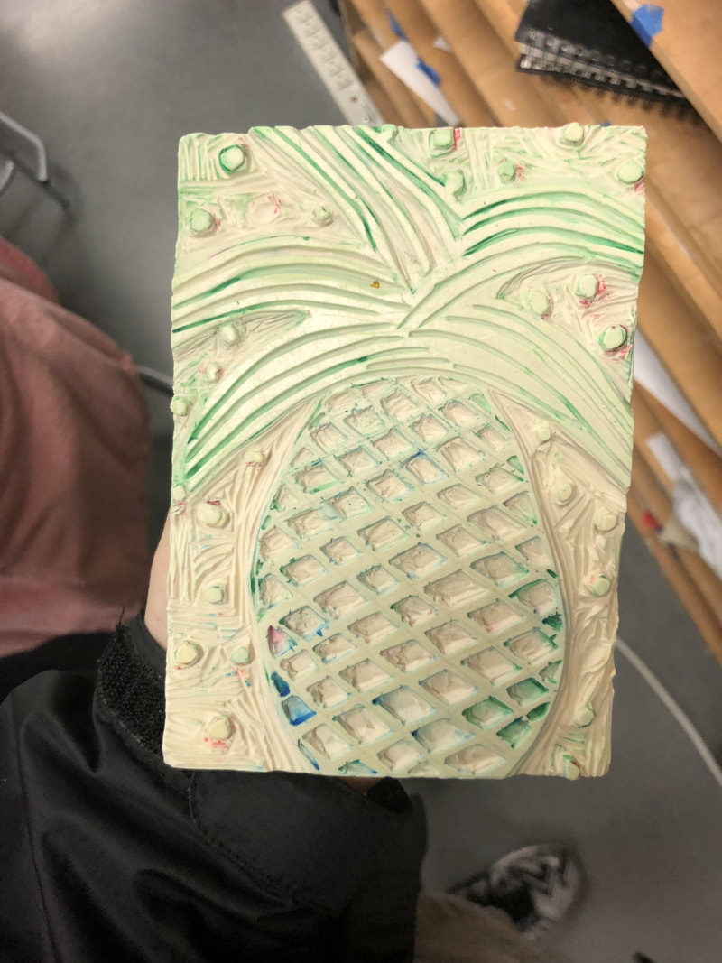
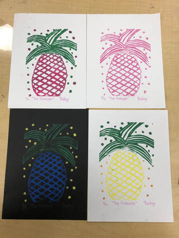 1. My piece shows off the theme of "line" because the top and inside of the pineapple is carved very carefully to make the pineapple look real and the stem of the pineapple is aligned well to create lines.
2. My piece is successful because it printed with no extra lines. It also didn't break or look spochly when it was printed onto the paper. If I were to do this over again I would probably do it opposite. Instead of carving the places I did I would carve the opposite. 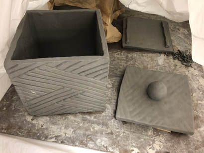 1. I plane to paint inside the cracks with a darker color and the outside with a lighter color. I plan to paint the inside clear and the top nob a light color and the rest of the top clear. I want to finish it by firing it to make it shine.
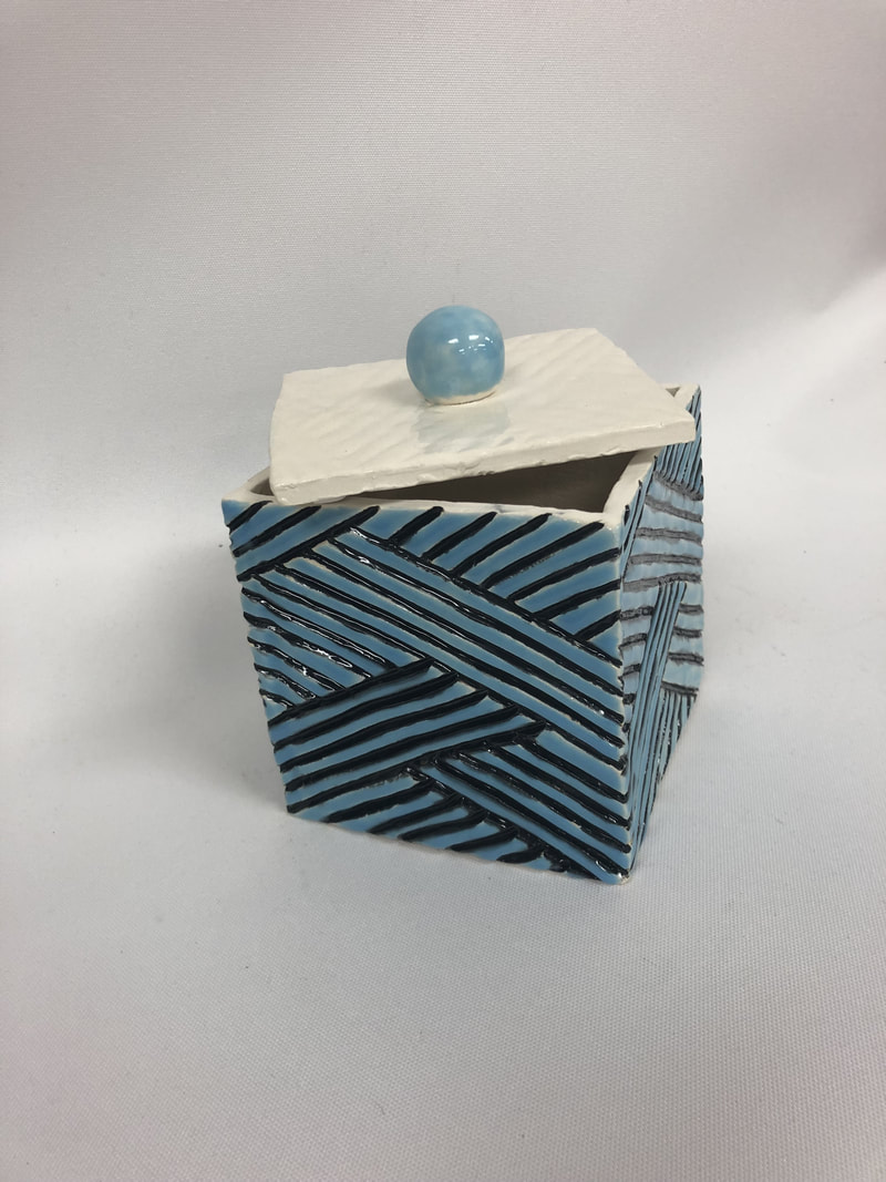
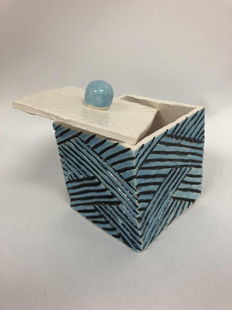
2. So far I found carving the box difficult. This was difficult because it was hard to keep the lights straight and even. 3. So far I found creating the lid successful. 4. First I created a slab and cut out all the sides and bottom/top of my box. I then scratched and slipped to connect the slabs together. After that I left it to air dry for one day. I came back and carved out the outsides to create the design I wanted. Then it was fired to be in the bisqueware phase. I glazed it and then it was fired again and now it is in the glazeware phase.
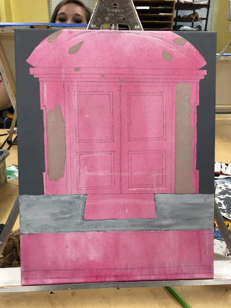
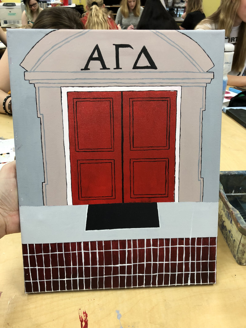
1. The place represented in my art is my sister's sorority house Alpha Gamma Delta at The University of South Carolina. This place is important because hopefully I will carry on the legacy next year.
2. The most challenging thing I found about this picture was how all the lines were very straight so I had to make sure my painting was precise. 3. The most successful I feel is the red door and the details on it. 4. First I started with drawing in the house with pencil and then added colors layer by layer to get the full effect. My mentors name is Stacia. She likes to do acrylics and pen and ink with watercolor. Her profile link is stacia-apex-2018.weebly.com. I think I will benefit from this by learning new ways of art and trying them out. Out of this, I want to learn more about every kind of art Stacia knows about. It is very interesting to me and would be awesome to learn more about.
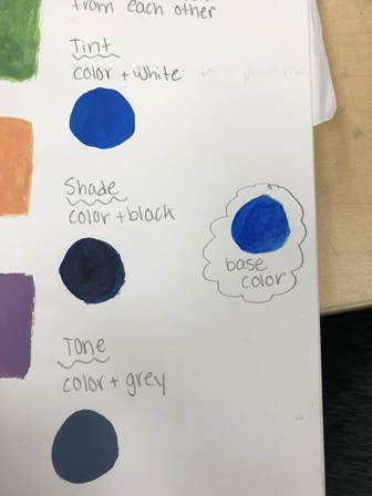
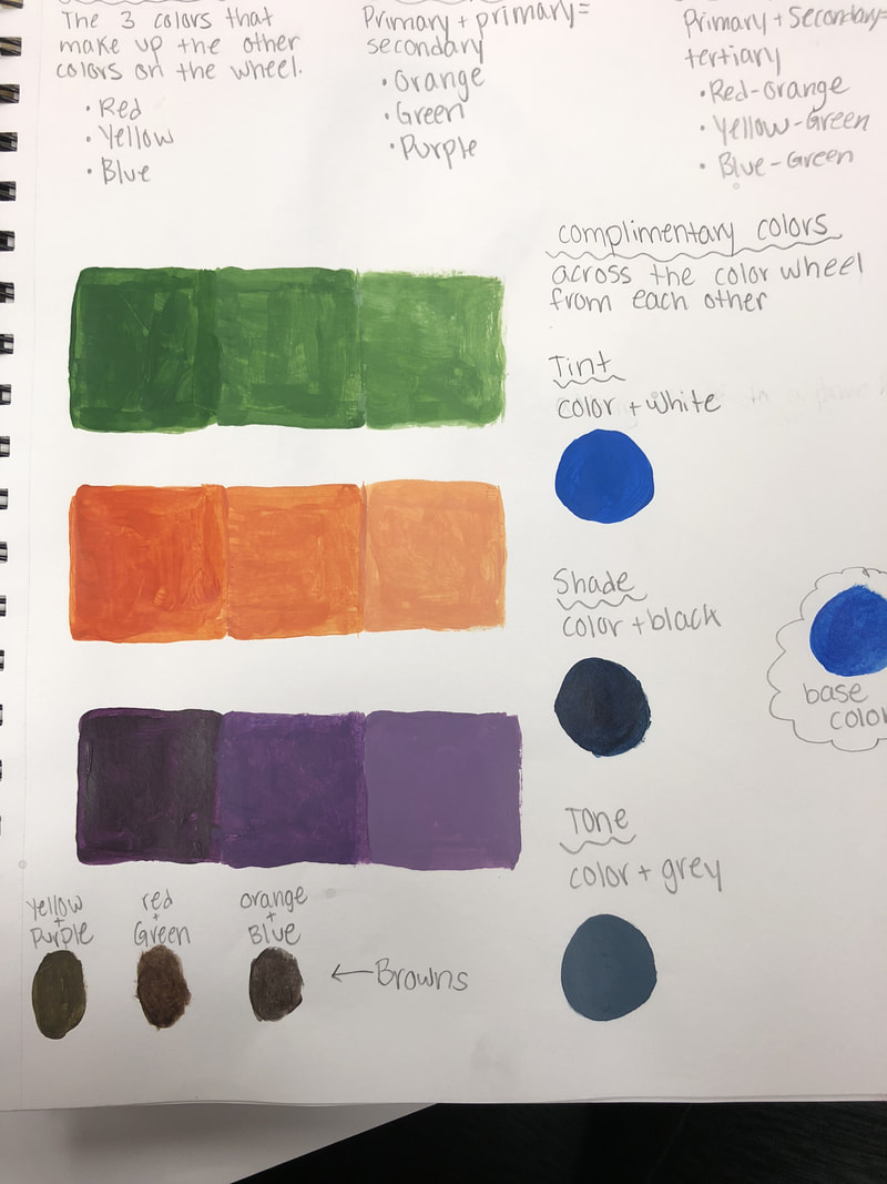
 From this activity, I learned that to make colors in different shades you can mix white with it to make it lighter and black with it to make it darker. I also learned that you can also add in a little bit of the compliementary color to get the shade you want. 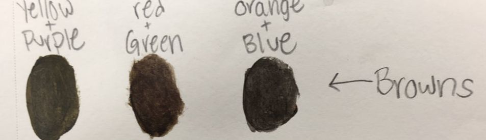 You make brown by mixing complementary colors. For example: red/green, orange/blue, and yellow/purple.  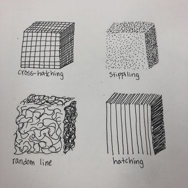 The most helpful warm up for me was the pen cubes. This helped show me the ways to coloring in a pen piece. I learned that instead if just coloring in with no direction you use these designs to make it look for professional.    Composition- the placement or arrangement of visual elements or ingredients in a work of art, as distinct from the subject of a work. Organization of elements of art according to the principles of art. Value- lightness or darkness of tones or colors. Charcoal- Pros: If you mess up you can easily fix it and it's easy to make dark shades. Cons: very messy.
Pen- Pros: Lines are very straight and precise. Cons: once you mess up you can't erase it. Pencil- Pros: Can erase if you mess up and it makes highlighting your piece easier. Cons: Can be hard to smoothly shade correctly. |
AuthorWrite something about yourself. No need to be fancy, just an overview. ArchivesCategories |

 RSS Feed
